


Next: Adding Items to the
Up: The new_item Function
Previous: The new_item Function
The following list describes all tags with their parameters, for which
classes they are allowed or required and which methods the tags are
related to. The tags are sorted by class, starting with the basic
class Item followed by its subclasses. Of course the tags are
always valid for all subclasses of the listed classes. Again for a
detailed explanation of the class hierarchy (and the methods the tags
are related to) you should consider the handle documentation in
chapter 9.1.
You might just scan through this rather long section to see what's
available or skip reading it since it serves as a reference and it not
necessary for understanding the rest of the chapter.
- I_Name, char *name (Item "set-name"):
-
Define a name for the item. If no name is given then for interactives
the label, method or action and for textmessages the text is used
instead. If none of these is given the item will be named according
to its class and you will get a warning (because it doesn't make much
sense to create for example a button which is labeled ``button'' and
sends the method "button" when it is pressed).
- I_Size, double sizex, double sizey (Item "set-pref-size"):
-
Set the size of the item. If you only want to set the width or height
of the item you can use I_SizeX or I_SizeY instead. If there
is no place for the item in the group it is added to it will not be
visible until you make the group big enough. For groups with follow up
groups (like the option menus) the behaviour is different: all groups
will be checked until the item fits into one of the groups. If
MENU_MAX_SIZE is specified, the item will be as wide/high as the
group it is added to (only if there is enough free place), if the
group size is changed the item is scaled accordingly.
- I_SizeX, double sizex (Item "set-pref-size"):
-
Only set the width of the item. The item gets the default height 1
which should be ok for buttons, rulers, sliders, inputs etc. For some
items like groups you should also set the height using I_Size
instead.
- I_SizeY, double sizey (Item "set-pref-size"):
-
Only set the height of the item. For the width of the item the group
size is used therefore it will change its size if the group is
resized. If the item should have a fixed width you should you
I_Size instead.
- I_RSize, double fracx, double
fracy (Item "set-rel-size-mode"/"set-pref-size"):
-
Define the size of the item relative to the group it is in. fracx
and fracy define the fractions of the group width and
height that will be used for the item. If the item is placed in a
layer then resizing the layer will also scale the item. To fill a
group with items which have relative sizes, the fracx and fracy
values should add up to 1. I_RSize is very useful for items
in groups with border and/or title, because the border and title size
don't have to be taken into account when selecting item sizes.
- I_RSizeX, double fracx (Item "set-rel-size-mode"/"set-pref-size"):
-
Only set the relative width of the item (see I_RSize about
relative sizes). The default height is 1 as for I_SizeX.
- I_RSizeY, double fracx (Item "set-rel-size-mode"/"set-pref-size"):
-
Only set the relative height of the item (see I_RSize about
relative sizes). The default width is the size of the group the item
is in, see I_SizeY.
- I_Pos, double posx, double posy (Item "set-pref-pos"):
-
Set the position of the item. Positions are calculated from the upper
left corner of the group the item belongs to, they are given in
``normalized'' coordinates (the default width of the control device
window is 12). Be careful:
 is the position
of the lower left corner of the item, therefore if the item has
height 2 and should have a distance of 3 from the top of the group
then you have to use 5 for posy. You should avoid defining
many items with fixed positions but use groups instead.
is the position
of the lower left corner of the item, therefore if the item has
height 2 and should have a distance of 3 from the top of the group
then you have to use 5 for posy. You should avoid defining
many items with fixed positions but use groups instead.
- I_PosX, double posx (Item "set-pref-pos"):
-
Only set the horizontal position of the item. The vertical position
will be calculated automatically. See I_Pos on how positions are
calculated.
- I_PosY, double posy (Item "set-pref-pos"):
-
Only set the vertical position of the item. The horizontal position
will be calculated automatically. See I_Pos on how positions are
calculated.
- I_Color, VEC3 rgb (Item "set-color"):
-
Set the color of the item. You should avoid using direct rgb colors
because the number of colors for the control window is limited. If you
really need colored items you should use I_ColorIndex instead,
then the already predefined colors are used.
- I_ColorRGB, double r, double g, double b (Item "set-color"):
-
Same as I_Color with the same restrictions, but the rgb values can
be given separately.
- I_ColorIndex, int index (Item "set-color-index"):
-
Choose a color for the item from the predefined control window colors.
These colors are
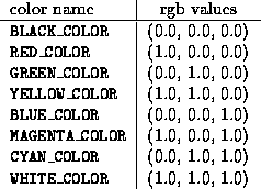
The colors FOREGROUND_COLOR, BACKGROUND_COLOR,
PRESSED_LOWER_COLOR, PRESSED_UPPER_COLOR,
TEXT_COLOR, LINE_COLOR, LIGHT_ON_COLOR are used
for drawing the items in the control window, their values depend on the
system.
- I_FillMode, int fmode (Item "set-fill-mode"):
-
Define how the item should be placed within its group if no position
was set with I_Pos(X|Y). MENU_FILL_TOP will place the item
as far top and left and MENU_FILL_BOTTOM as far bottom and
right as possible. Layers can be placed relative to the mouse position
with MENU_MOUSE_RELATIVE: in this case the position set with
I_Pos(X|Y) is used to determine the offset of the lower left
corner of the layer relative to the mouse. Default fillmode if
MENU_FILL_BOTTOM for textmessages and rulers and
MENU_FILL_TOP for all other items.
- I_AddAction, char *add, char *remove (Item "set-add-action"):
-
The add-action add resp. remove-action remove is called
on the item every time it becomes visible resp. invisible, for
example when the menu is changed. A visible item may be hidden
(temporarily) by open layers, this will not result in a call to the
add- or remove-action. If a layer has been bound to the item with
"layer-list-add" and "add-layers" is used for add and
"remove-layers" for remove, then the layer is only visible
in the item's menu.
- I_HelpText, char *text (Item "set-help-text"):
-
Set the help text for an item that is shown when the middle mouse button is
pressed while holding the control key. This text is intended to serve as a
short online-documentation of what happens when the item is used.
- I_State, int state (Button "set-state"):
-
This will set the state of a button to PRESSED or UNPRESSED.
Since the default state of a button is UNPRESSED only setting it to
PRESSED makes sense.
- I_DrawMethod, char *draw (Button "set-draw-method"):
- Set the method that
will be used to draw the button. For example the method "draw-arrow" is
used to draw ruler and scrollbar arrows. If you want to write your own draw
method you should consider the handle documentation.
- I_Align, ALIGN_FLAGS align (Textmessage "set-align"):
-
Define how the text of the textmessage should be aligned. afTop,
afCenter and afBottom can be used for vertical,
afLeft, afCenter and afRight for horizontal alignment.
The default value is afLeft|afCenter.
- I_Text, char *text (Textmessage "set-text"):
-
Set the text of the Textmessage. The text is copied to an internal
buffer therefore you have to use this method everytime you want to
change the message. A copy of the text can be obtain with the
"get-text" method. The message can be aligned using I_Align,
default is left aligned and vertically centered. The text may consist
of several lines separated by
\n (like in printf).
- I_Action, char *action (Interactive "set-action"):
-
The action is send to the interactive when it gets some input, for
example when a pressed button is released or when the return key is
pressed while an input is active. For buttons the default action sends
the method set by I_Method to the instance set by
I_Instance or the current instance of the manager if none was set,
for all other interactives the method is send to the interactive
itself. Before writing you own action method you should consider the
handle documentation on what an action has to do for a specific class.
- I_Instance, INSTANCE *inst (Interactive "set-instance"):
-
Define to which instance the method of the interactive (set by
I_Method) should be send. By default the method is send to the
manager's current instance.
- I_Self, (Interactive "set-instance"):
-
This is a special case which can't be handled by I_Instance: the
interactive is set as its own instance. This if often used for buttons
if their method can't be send to the current object because it
provides some special functionality not depending on a specific class.
Most buttons in the manager menu use I_Self, the mark button for
example sends "mark" to itself to store the current instances as
marked instance in a local variable.
- I_Method, char *method (Interactive "set-method"):
-
Set the method that is send by the interactive's action (see
I_Action to the interactive itself or its instance set by
I_Instance resp. the manager's current instance if none was set.
- I_Label, char *label (Interactive "set-label"):
-
Define a label for the interactive (the text that is printed onto the
object). If no name was given then the label is used as name, too. For
inputs the label can be controlled by setting a print-format with
I_PrintFormat.
- I_Redraw, REDRAW_FLAG redraw (Interactive "set-redraw-flag"):
-
If the redraw flag is set to rfOn (default value), then every
time an action is caused by the interactive the graphics window will
be refreshed by redrawing the current object. If this redraw is not
necessary (as for example for the dismiss buttons in some layers) the
redraw flag should be set to rfOff to avoid this refresh.
- I_Inactive, (Interactive "set" INACTIVE):
-
Usually an item is active when it is created. If you need an item that is
only active under certain conditions, e.g. if the current object of the
manager has a special class, this tag can be used to inactivate the item.
- I_SideEffect, INTERACTIVE *effect (Interactive "add-side-effect"):
-
Side effects define how interactives depend on each other. For example
the input field and the ruler in a bar1d (which show the value of the
same variable) define each other as side effects. When the variable is
changed by one of these items then "mark-side-effect" is called
which sends "update" to all side effects, this will update the
value that is shown by the other one.
- I_BarColor, VEC3 rgb (Bar1d "set-bar-color"):
-
Set the bar color of the item. You should avoid using direct rgb
colors because the number of colors for the control window is limited.
Use I_BarColorIndex instead if possible.
- I_BarColorRGB, double r, double g, double b (Bar1d "set-bar-color"):
-
Same as I_BarColor with the same restrictions, but the rgb values
are given separately.
- I_BarColorIndex, int index (Bar1d "set-bar-color-index"):
-
Choose a color for the bar of the bar1d from the predefined control
window colors. See I_ColorIndex for a list of these colors.
- I_EvalFn, double (*eval)(double), double
(*ieval)(double) (Bar1d "set-eval-fn"):
-
The eval functions define how the variable the bar1d controls depends
on the value that is shown on the bar1d. By default
g_eval_ident_fn is used, therefore the bar1d shows exactly the
variable value. By specifying g_eval_exp_fn and
g_eval_log_fn you may create an exponentially or logarithmically
scaled bar1ds. Another predefined function is g_eval_angle_fn,
which is for example used by the rotation rulers
in the matrix editor to limit the angle value to [-180, 180]. Of
course you may define your own evaluation functions.
- I_MinMax, double min, double max (Bar1d "set-min-max"):
-
Limit the value for the bar1d to
 . If
. If  then the limits are ignored. Don't try to use both
I_Min and I_Max instead of I_MinMax, this will not work
because I_Min and I_Max also set a maximum resp. minimum
value. By pressing the right mouse button while the mouse is over the
bar of the bar1d you get a configuration layer which allows to change
these values and offset, scale and stepsize interactively (see
section 4.1.2.5).
then the limits are ignored. Don't try to use both
I_Min and I_Max instead of I_MinMax, this will not work
because I_Min and I_Max also set a maximum resp. minimum
value. By pressing the right mouse button while the mouse is over the
bar of the bar1d you get a configuration layer which allows to change
these values and offset, scale and stepsize interactively (see
section 4.1.2.5).
- I_Min, double min (Bar1d "set-min-max"):
-
Define the minimum value for the bar1d. The upper limit will be set to
the maximum default value
 . See I_MinMax for more
information.
. See I_MinMax for more
information.
- I_Max, double max (Bar1d "set-min-max"):
-
Define the maximum value for the bar1d. The lower limit will be set to
the minimum default value
 . See I_MinMax for more
information.
. See I_MinMax for more
information.
- I_FixMinMax, (Bar1d "fix-min-max" (ON, ON)):
-
By default the minimun and maximum values of a bar1d can be changed using
the bar1d's config layer, forbidding to change these values is useful since
it ensure that the value stays within a predefined range. If you want to
ensure for example that a bar1d value is always non-negative you can use
I_Min, 0.0 and I_FixMinMax.
- I_Offset, double offset (Bar1d "set-offset"):
-
The offset and the scale (set by I_Scale) of the bar1d define the
layout of its ruler. The scale is the difference between the ruler
values at the left (bottom) and right (top) position and offset
defines a ``starting value'': the values of the ruler in its end
positions will be offset + n scale.
- I_Scale, double scale (Bar1d "set-scale"):
-
Set the scale for the bar1d. See I_Offset on how scale and offset
determine the layout of the bar1d.
- I_StepSize, double stepsize (Bar1d "set-step-size"):
-
The variable of the bar1d will be decremented resp. incremented by
stepsize when the arrows next to the ruler or slider are
pressed. Pressing these arrows will always (apart from limits) result
in a value that is a multiple of stepsize, therefore if the
current value is 0.5 and stepsize is 1.0, after the first click on the
incrementing arrow the value is 1.0, a second click will give 2.0 and
so on. By the way, these arrows have an auto-repeat feature -- just
keep them pressed.
- I_ValueChanged, char *vchanged (Bar1d "set-value-changed"):
-
Define a method that is set to the bar1d every time its value is
changed. This method is used to distinguish between interactive
changes of the ruler (clicking into the ruler or on an arrow or
entering a value in the input field) and non-interactive changes
(changing the variable of the ruler by a function/method or as a
side-effect). For interactive changes this method is called by the
bar1d's action (see I_Action).
- I_PrintFormat, char *pformat (Bar1d/Input "set-print-format"):
-
Set a format string which is used to print the value onto the input
field if it is not active. This pformat is used in an sprintf
with the value of the input as first and the label as second
argument. Additional to the normal printf formatting options a number
n followed by $ is allowed as modifier, this will select
the nth argument for this format. On SGI machines this is done
by the standard printf function, on other systems this is emulated.
- I_Var, void *var, DECLARATION_FORMAT df[, int maxsize] (Bar1d/Input "set-var-and-type"):
-
This tag is required -- bar1ds and inputs don't make much sense without a
variable. The first argument is the pointer to the variable, its type is
defined by the second argument. For bar1ds the types dfInt,
dfFloat and dfDouble are allowed, for inputs also
dfString is possible. For inputs you have to specify the maximum
length of the input field as third argument, if dfString is used
this length should match the length of the var string.
- I_Var, int *var (CheckField/Checkbox "set-variable"):
-
The I_Var tag is also required for CheckFields and Checkboxes. These
classes always use an integer variable therefore only the one var
argument is needed.
- I_TabAction, char *taction (Input "set-tab-action"):
-
The method taction will be send to the input when the tab key is
pressed. At the moment this is only used for the input field in lists
to allow the completion of the input (like the command completion in
the tcsh).
- I_Eval, char *eval, char *inv_eval (Input "set-eval"):
-
The evaluation method is used to convert the input string into a
variable value, the inverse method is used for the conversion in the
other direction. Don't use I_Eval unless you know exactly what you
are doing, because these method have to handle print formats and if
the input is active or not.
- I_MaskMode, int mode (CheckField "set-mask-mode"):
-
Set the mask mode of a checkfield. Values allowed for mode are
G_CHECKFIELD_RADIO (only one checkbox in the checkfield can be
selected at a time), G_CHECKFIELD_CBOXES (checkboxes are
independed, but switch different bits in the checkfield's variable) or
G_CHECKFIELD_CUSTOM for custom defined checkfields.
- I_NewBox, CHECKFIELD_VAR id, CHECKBOX *box (CheckField "insert-checkbox):
-
Add a new checkbox to a checkfield. id is used to determinate which bits
of the checkfield's variable should be switched. The id's of different
checkboxes of the checkfield should access different bits of the checkfield
variable. Of course you can use new_item(Checkbox, ...)
to create the box.
- I_Type, int type (Line "set-type"):
-
For lines the types LINE_FLAT and LINE_ELEVATED are
allowed. You should avoid using lines to separate items and use groups
instead if possible.
- I_Item, ITEM *item (Group "add-inter"):
-
Add an item to the group. Of course this item can be a group itself,
it also be created by new_item (the function may be called
recursively).
- I_Border, BORDER_FLAGS bflag (Group "change-border"):
-
Select if the border (bfBorder) or title (bfTitle) or both
(bfBorder|bfTitle) of the group will be drawn, default is
bfNoBorder for groups and bfBorder|bfTitle for layers. Be
careful: switching on the border or title will reduce the interior
size of the group, the border takes up 0.5 in each direction, the
title 0.75 in vertical direction.
- I_FixSize, int fixx, int fixy (Layer "fix-size"):
-
With ON for fixx/fixy the layer size can be fixed
horizontally/vertically to its predefined size. By default the size is
not fixed (OFF for both fixx and fixy), the layer
then can be sized with the mouse (see section 4.1.2.1).
- I_ButtonList, BUTTON_DESCR *bdescr (Group ):
- The tags
I_ButtonList, I_RulerList and I_SliderList should only be used
for converting old projects (they correspond to P_ButtonList,
P_RulerList and P_SliderList, they makes it possible to
group the buttons, rulers or sliders together in one group. Be careful with
I_ButtonList: for P_ButtonList the button instances may be
uninitialized (a pointer to a class defined in the same project can be
used), for I_ButtonList this is not allowed.
- I_RulerList, RULER_DESCR *rdescr (Group ):
-
See I_ButtonList.
- I_SliderList, SLIDER_DESCR *sdescr (Group ):
-
See I_ButtonList.
Next: Adding Items to the
Up: The new_item Function
Previous: The new_item Function
SFB 256 Universität Bonn and IAM Universität Freiburg Copyright © by the Sonderforschungsbereich 256 at the Institut für Angewandte Mathematik,
Universität Bonn.